![]()
The story:
I was recommended by a friend to make a website for a car service station that was opened a few months ago with no presence on the web or other means of promotion. Even if it was a rather small project, as I was learning UX I spotted right away the chance to apply the things that I learned and go deeper into the problem and try to solve it with design thinking instead of just doing a website.
The problem
I was asked to build the website really fast, had around 2.5 weeks to build it, the owner wanted to increase his business in March, as he expected an increase in the demand for technical car inspection in this period.
One of my struggles was the fact that the owner refused to consider an online appointment app or feature, the clients had to call or go to the station directly so I knew from the start that I had to promote the call to action and position well on google maps.
I looked over the competition and I saw both a struggle and an opportunity there, they were quite a few other companies present but they were not investing that much effort in the online presence, they did not have very well optimized websites and only a few were doing paid promotions (Google ads).
The owner agreed to invest monthly in a google ads campaign, but the budget available was really low (a bit over 1 euro per day! ) so I knew I needed to convert as many clicks as possible into clients.
First Steps
I made an initial visit to see the location and met with the owner in person.
He put me in contact with a few of his customers to be able to gain some insight from them and be able to understand them better and empathize.
Using the information from my initial research I started by building the persona and the journey map.

Then I sketched some fast prototypes, having in mind also the site structure. Was thinking to do only 3 pages – Landing Page, Info and Contact, short and sweet.

I was asking myself some questions there: Is It possible to implement a direct call button and have tracking installed on it? if not I would just send users to contact page. What kind of photos should I use? In which order should I present the car categories and prices (start with the most common or with the lowest price).
The Logo
I researched the 2 base colors for the brand. The color blue is the color of trust and responsibility, amplifying the professionalism of the business.
The color green symbolizes the start, permission to go (like a green light or start of a race), approval and a good condition.
The check mark on the car symbol makes an emphasis on the above qualities. I choose Lato font since I could easily apply that to the website too, for consistency.
Developing the website
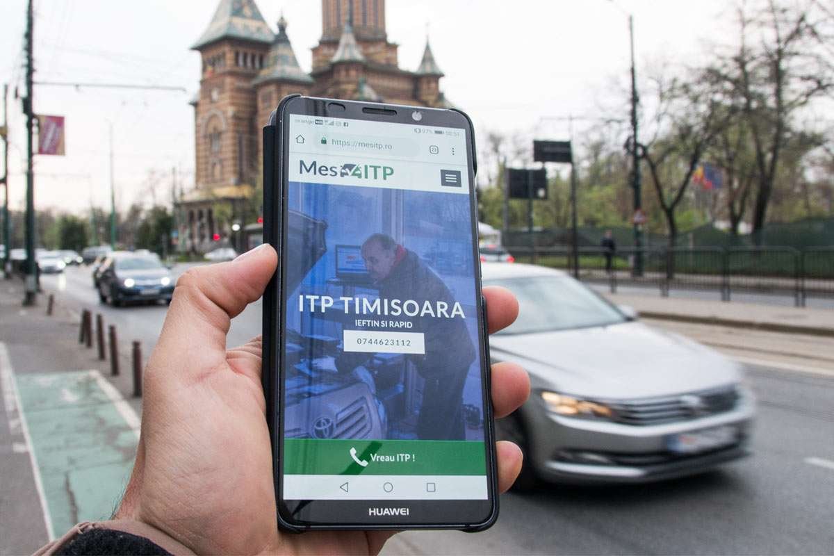
Knowing that the bulk of our target clients use mobile devices, some special features were added for mobile. A button appears only on mobile and when clicked activates a direct phone call to the service station. The button had a GA tracking script so that we know how many people use it, it shows up in behavior events.
Google maps was integrated on the contact and home page, giving some helpful landmarks around so that the place can be identified and reached more easily.
Also I added a button for directions.
Next to the main information (contact and prices) extra information was added – guiding the clients on which documents they need, explaining the process and some useful exempt from legislation. Was hoping that through this extra information to make the entire process more open and attract some organic traffic too.

Learning from mistakes and adjusting
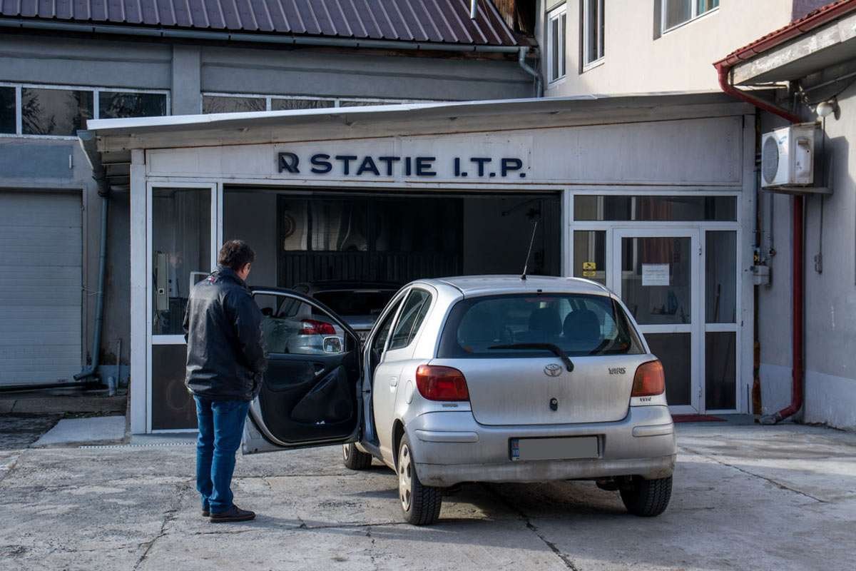
Having in mind a professional look I used stock photos of a mechanic for the hi-fi mockups and for the first release of the website then I realized that is a mistake and it will be much more effective and personal to use real photos. People don’t always come with the car in perfect state to the service and having a real, warm image, is more effective than a cold professional one.
So I made another visit to the service, carrying the camera with me, I took some shots of the service and the actual work carried there and also some shots for Google Maps with the location surroundings and access points, because while doing a search on Google Maps I found some outdated information there.
They were useful for the website too, on the contact page.

below is the website as seen on desktop

Optimisation and improvement
The effort was targeted towards making a difference from the competition, I extracted the most obvious advantages – the lowest price was lower than his competition, after being refused for a problem, the coming back is free and they also receive counseling, and that the station was opened on weekend too (Saturday)
First step was to create a Google Ads campaign and try different approaches on the call to action and description. I made notes when I made changes and I quickly adjusted after each experiment.
Went in parallel with the website information, and what I found was working in the ads, I integrated in the website too.
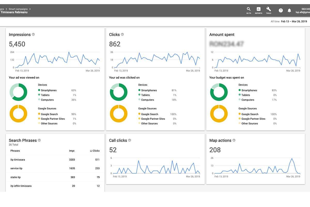
Some initial stats.
The device data and the demographics confirms my initial data about the users targeted for our site.

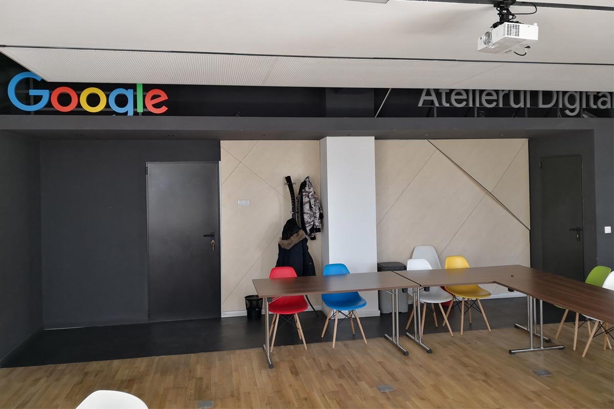
I realized I can do more with Google Ads and Analytics (my campaign was basic) but i did not have all the necessary knowledge so I made a visit to our local Google Office for a consultation and also started documenting online.
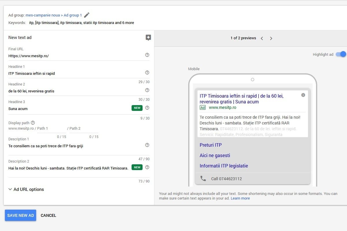
I gained enough info to unlock the advanced campaign that can display more text – headlines, descriptions and now we have extensions!
This was an important step because only one of our competitors had the advanced campaign, all the rest were basic, so this could be an important step to differentiate from competition.

Another struggle
was to get reviews on google maps, people were happy with the quality of the service but they were not sure how to leave a review so an informational graphic was made and printed to be displayed in the office, inviting customers to leave a review, and it worked! Clients started leaving feedback. I looked carefully over the words they used to describe the experience and a new campaign was added on Ads, more personal.
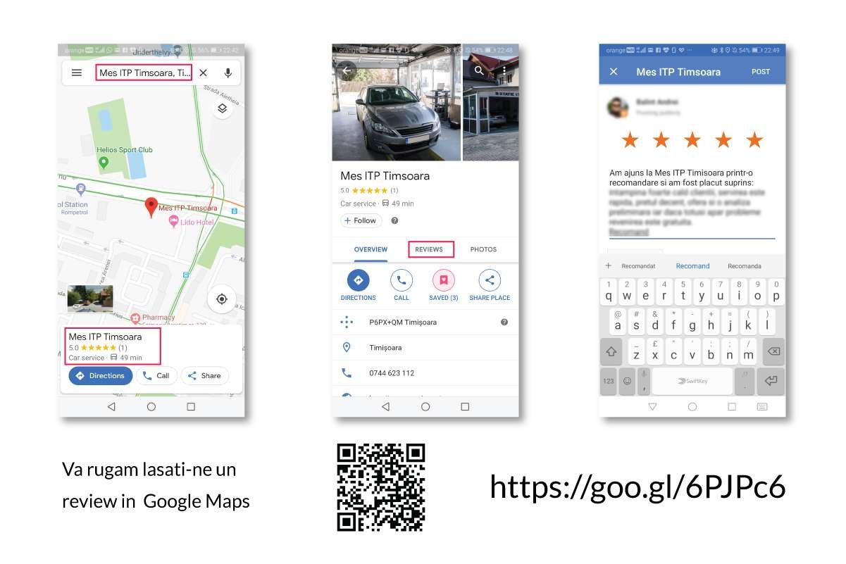
Also I found a way to integrate some of the reviews on the website and to put up the instructional graphic there too, being a website there was the advantage that it could offer a direct link. Even better!

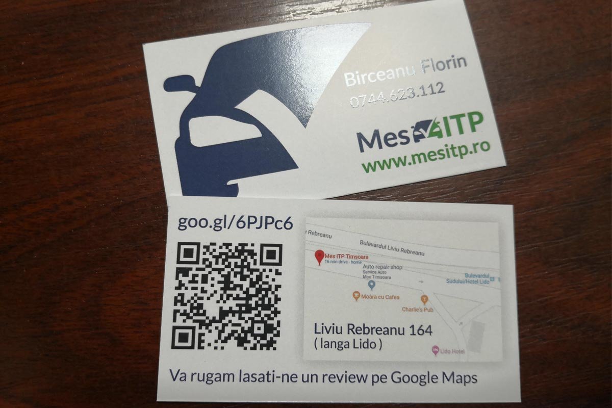
Business cards were created and on the back side they also had the map and the review instruction in a more simplified way