![]()
With my designer skills, I optimized the digital products, increased user engagement and trust. contributing to the growth of the largest Austrian loyalty program by 10% to over 4.5 million members.
I was involved in various projects, creating new features, improving the flow at Kassa, and upgrading the Digital Membership, which gave users more control over their data. I also changed the company’s design process and facilitated efficient, interactive collaboration with developers and other teams. I faced challenges, such as migrating the entire design project from Sketch to Figma, conducting intensive research and testing for the Digital Membership project, and working with sensitive legal topics. The case study will show how I overcame these challenges and delivered successful results for the company and its users.

The Problem (s)
jö Bonus Club is the largest customer loyalty program in Austria, which connects 4.6 million jö members (out of 8,9 million Austrians) with the REWE Shops + other big Austrian partners. The jö members use the digital app or the plastic jö karte when shopping.
– The number of plastic card users (analog) was quite high and we knew that we couldn’t reach them as well as the app users (the app has more content and functionalities and our target was a daily longer usage not just for a few minutes at kassa) so it was clear we needed a change.
– One of the reasons for the current state was a trust issue with our users because of a privacy agreement not being done correctly before which led to a fine and a media scandal. Our membership model was not transparent enough and had to be fixed to bring more transparency to the users and regain their trust.
– The initial company process for design and design collaboration was not clearly defined and structured.
Here is how we solved this issues.
My Role
I was hired as an UX / UI designer to solve the previously mentioned problems, optimize the current digital products – jö app, website, and tower (a tablet), create new features to make the app more usable and interesting, restore the trust of our users, entailment and increase their loyalty.
In my daily work I was collaborating directly with the product owner, CPO, and developers team, and depending on the project – marketing, partnership, or analytics team. I was actively involved in loyalty and engagement campaigns.
Changing the company’s design flow
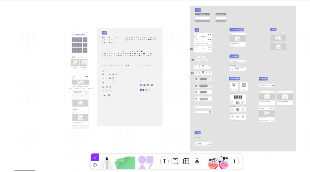
– After I came to the company I started by analyzing how things are done and then managed to change the old design process from using 2 separate software (Sketch + Zeplin) to a unique collaboration software – Figma and to simplify the way the design projects were structured (previously separate projects for Android and iOS) to one general project that can be maintained more efficient and direct with the developers.
– When collaborating with developers and other teams, instead of offering them a static page (like previously) they were invited to the live project where they could navigate the full flow, inspect, and interact and they were encouraged to give feedback and I also supported them with tutorials and explanations.
Challenges
– Migrating the entire design project into another software (from Sketch to Figma) together with libraries (more than 40 design files and 1000 components in the Library ) was not an easy task as many things got broken on import and I had to find ways to solve this efficiently and automate some of the tasks as they were quite intensive.
– The project called “Digital Membership” that was set to solve the user trust issue was a very intense and legally sensitive project, involving a large crossfunctional team and multiple departments, intensive research, testing with different methods and several legal compliance reviews.
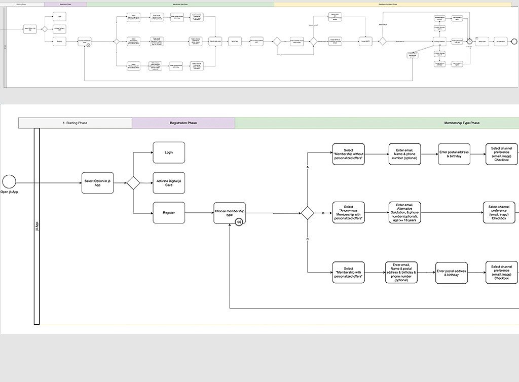
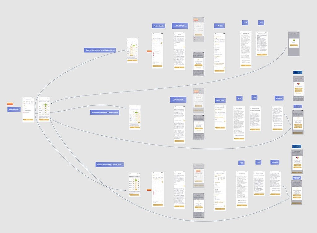
– A complete redesign of the registration flows was needed for the Digital Membership (previously we had just one membership type and the flow was not very intuitive in some points)
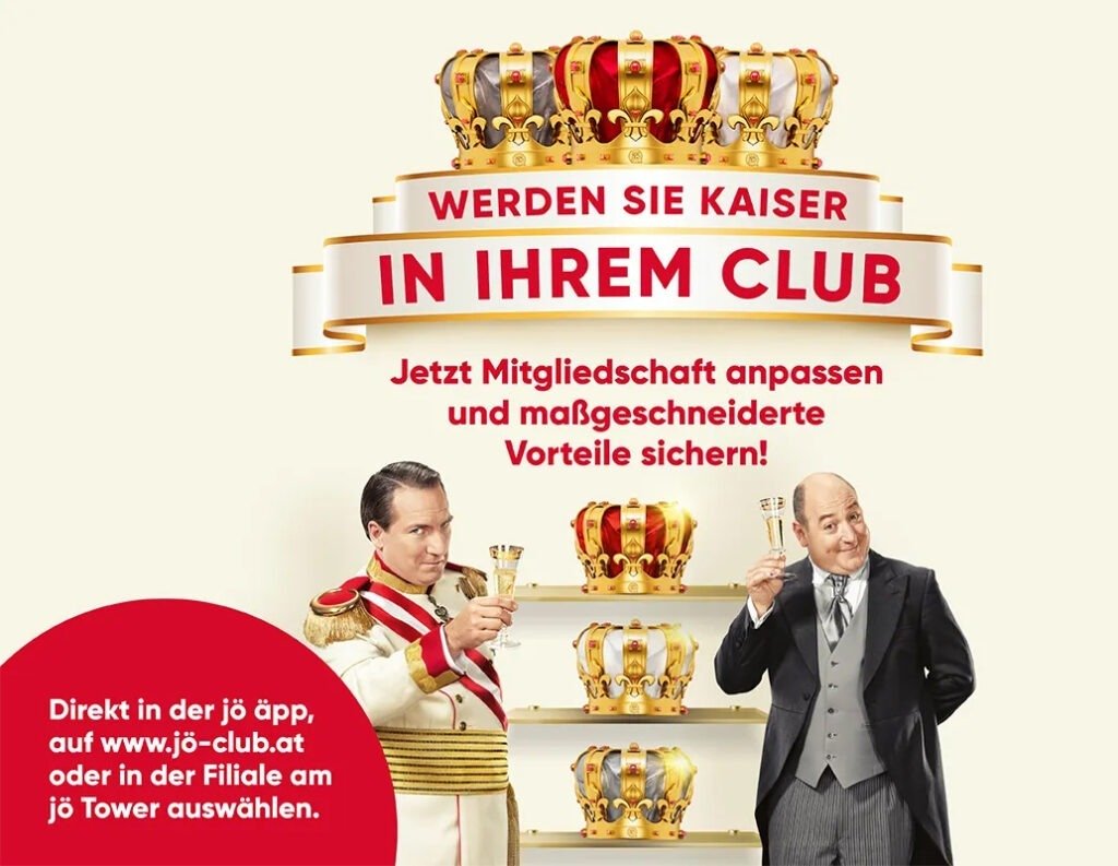
The Digital Membership
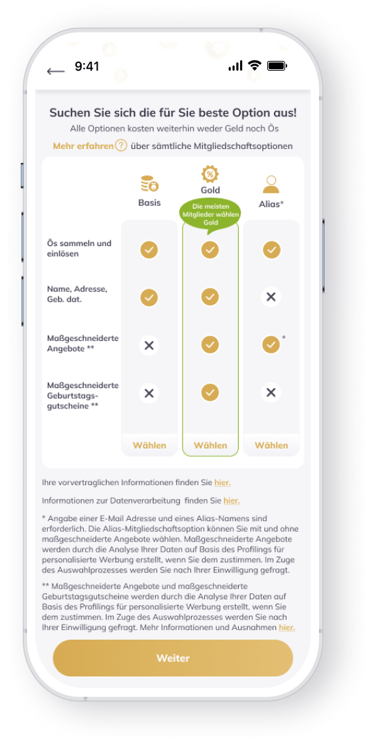
The “Digital Membership” project was created to solve the user trust issue by bringing more transparency and control to the users regarding their membership and give them more choices for the data shared with the company and the possibility to chose from multiple types of memberships (previously we had just one membership) and after further customize their membership.
The project extended across all our products (app, web, tower) and was developed by me in collaboration with an extended team over several months, almost one year.
After launch, we saw that our research assumptions were validated (the majority of the users chose the full benefits – Gold Membership and we could reach out better to our users with dedicated vouchers and campaigns). Also, we saw an increase in engagement and daily app usage.
My process
I began by establishing our targets and initial suppositions, had a kickoff meeting with the team, went into research, gathered all available data, and made some fast sketches and then wireframes ( in Miro and Figma). A catchup with the team was next to ensure we were on the right track. With the business analysts, I worked on initial diagrams for the user flows.
The wireframes were turned into prototypes which I used for interviews and usability testing with our users. Later we also made large quantitative testings and A/B testing with surveys using Maze and my Figma prototypes with the help of an external company.
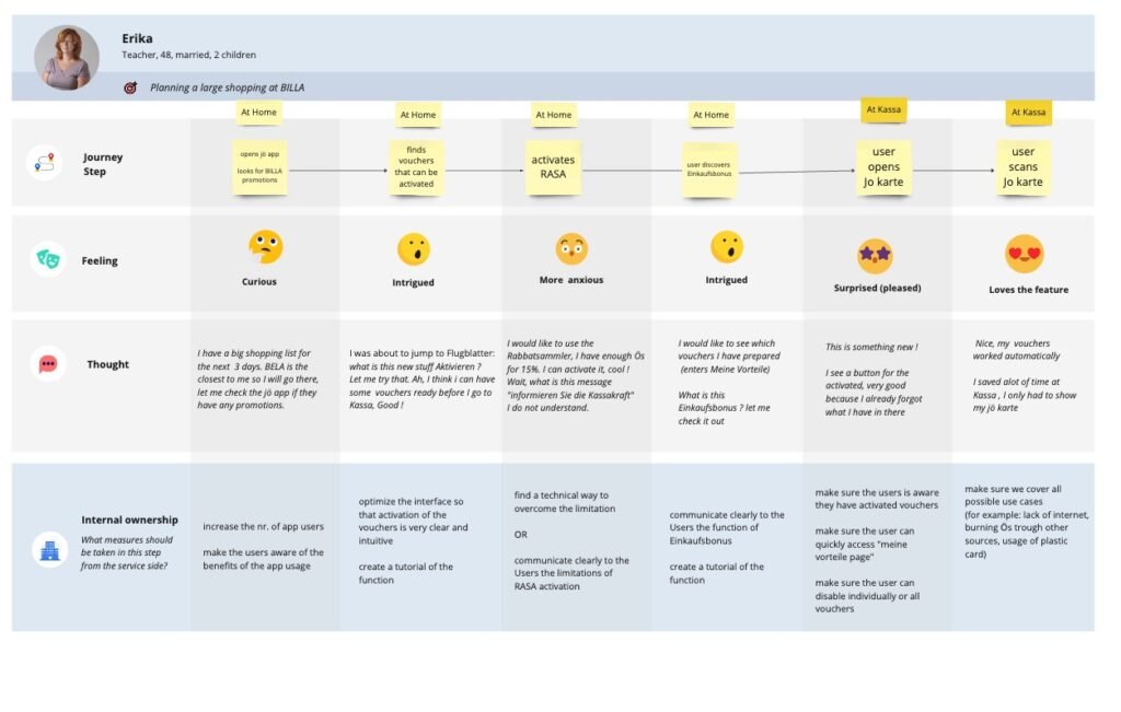
Research and testing for the digital Membership
The research was intensive because we were trying to solve an important and sensitive problem for our company and our customers, so we tested several different flows with our users using different methods – focus groups, usability testing, and surveys, which helped us create the final flow for our users.
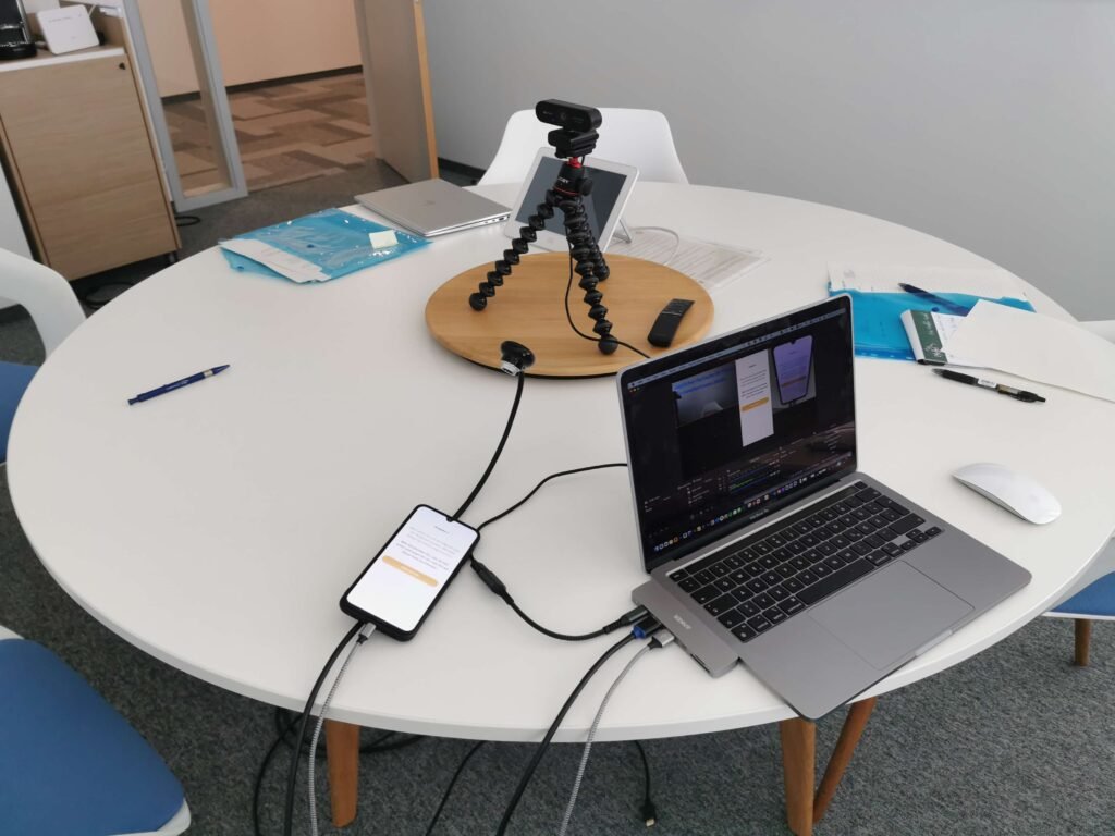
The most effort (but also the most revealing) for me was for the usability tests, where I had to create a research plan, identify the target users, schedule meetings, and prepare all the necessary documents then I teamed up with the PO and met directly with users and realistically simulated different flows.
I created a custom system (after I got inspiration from a website) to capture simultaneous a feed from the phone (a direct cable) and the user’s finger movement (a small camera on top), which proved very useful to see if a user was hesitating on a screen or a button or was not able to find how to solve the task.

The High Fidelity
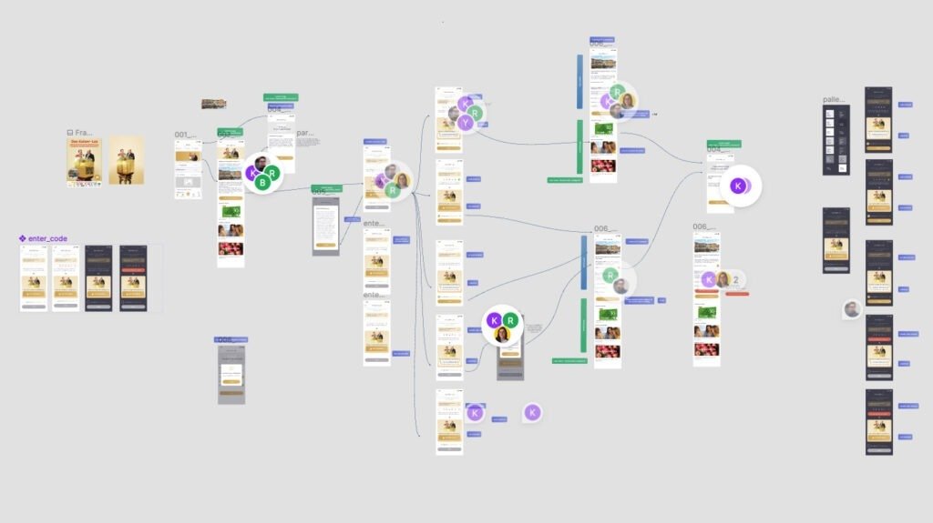
In the end, there were a few hundred screens connected in more than 30 different processes. I had to group, label, and document everything so that it was very logical and easy for other teams to align and understand. For demonstration and instructional purposes, I connected the designs to clickable prototypes and was able to present the flows interactively and interestingly.
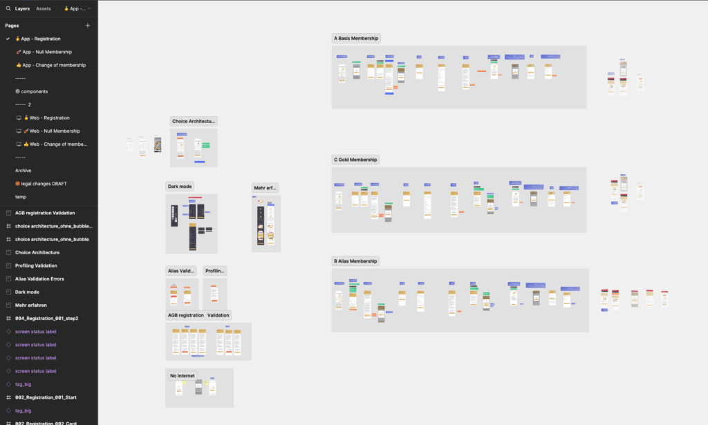
The designs were then discussed and aligned with the stakeholders and developers team + business analysts and requirements engineers to make sure once more that the concept is also technically feasible.
As I mentioned earlier everything was done and discussed in Figma + Confluence, and in the end, the developers managed to get their assets directly from there in most of the cases.
During the implementation together with the product owner, I was watching and testing in staging the implementation to make sure the project was implemented correctly.
Conclusions
After launch, we saw that our research assumptions were validated
– the majority of the users chose the full benefits – Gold Membership and we could reach out better to our users with dedicated vouchers and campaigns.
– Also, we saw an 15% increase in engagement and daily app usage.
– Our user base continued to grow (over 4.6 million members)
Other projects – different engagement campaigns
I worked closely with marketing and partnership (CRM) departments to develop several gaming and marketing campaigns My particular contribution was designing the flows for the users, how they can enter the campaign, interact, and be rewarded. The gamification proved to be successful and we saw an increase in the daily usage of our app and engagement of our users (time spent per session).

Research for new features